Hand Lettering Tips for Visual Notes
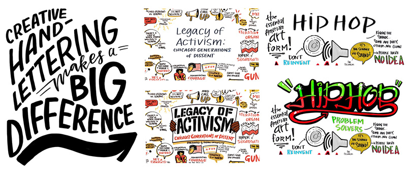
It doesn’t take a professional eye to notice that creative hand-lettering makes a big impact while taking visual notes! At Ink Factory, our artists block off 5-20 minutes before our live drawing events in order to draw an eye-catching title. Having a couple of hand lettering tips up your sleeve is helpful for drawing titles and illustrating points throughout your notes. Today we’ll show you some easy hand-lettering tricks to up your visual notes game.
Hand Lettering Tips – #1
Block lettering
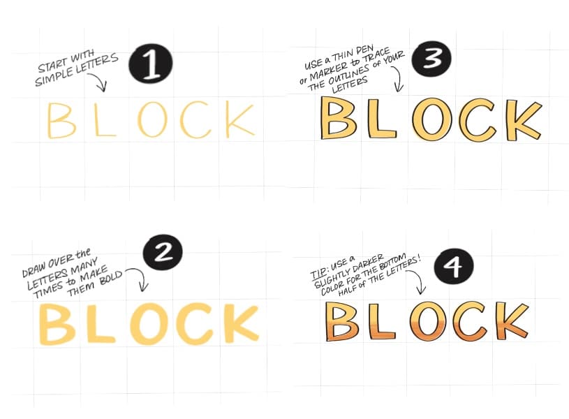
Block letters are an easy way to make a word seem especially important. When practicing, it’s helpful to practice on gridded paper. This will help you to manage spacing and increase consistency! If you’re using an iPad to draw, we recommend using the app, Procreate. Under the canvas settings, toggle on the “Drawing Grid” and adjust as needed.

Whether using a tablet or paper, it’s important to start simple. We’ve outlined our steps to making block letters below:
Hand Lettering Tips – #2
Turning objects into letters
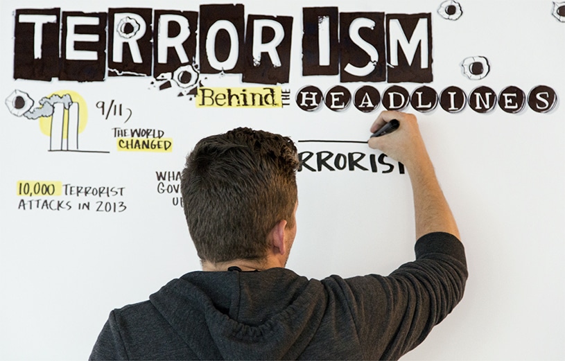
Make your lettering more memorable by drawing objects in place of the letters.

Start out by drawing the letters that make up your chosen word. It’s easiest to use uppercase letters for this technique. While drawing the letters make sure there is plenty of space between them! Once you start drawing objects on top of the letters the spaces between letters will be quickly filled. And the more you experiment with turning objects into letters, the easier it will be!

Hand Lettering Tips – #3
Use lettering to establish importance
If you’re new to visual communication, take some time to learn about visual hierarchy. Embellishing letters can be a fantastic way to add emphasis to your content and let your viewers know which points are most important.
At Ink Factory, we generally save the most special hand lettering styles for our titles. Titles are usually the most important piece of content in our visual hierarchy because they allow the view to quickly glance at the notes and know what they’re all about. If you match the visual style of your title’s lettering to the content, even better!

We also like to clearly differentiate high-level or key concepts from supporting concepts in our notes by using bold hand lettering or block letters. Note the difference between the title, the key points, and the supporting points in the example above.
For the lower levels of our visual hierarchy (information that supports key ideas), we like to use smaller, basic all-caps handwriting. If we were to use decorative hand lettering for these points, they would not only be hard to read, but it would also add unnecessary emphasis to these points.
Hand Lettering Tips – #4
Use hand lettering as emphasis
You can also give your letters characteristics that reflect the content or mood of the content you’re drawing. Jagged, scratchy letters give off a manic or messy feel, while neat, serif lettering lends a professional, buttoned-up tone. If you’re looking to reflect a certain mood or style, take some time browsing font websites to use as a reference when drawing your letters. Here are some examples of how key words in titles can be turned into lettering that reflects the content:

As you review the examples, think about why these styles of letters match the words they represent.
Now that you have some new tricks and ideas for hand-lettering, start practicing! Once you get good at the basics, you’ll have more time and confidence to create impressive titles for your visual notes. The important high-level points in your notes will become more clear making your notes easier to read.

Curious to learn more?
Dive deeper with a workshop!

$44 | recorded workshop
Lettering & Handwriting for Live Visual Notes
In this 90-minute workshop, we’ll teach you the basics of fast & neat handwriting, hand lettering, and how we incorporate that into live visual note-taking.

