Break Free From Boring Presentation Design with Visual Notes
It’s official! Science has proven what we’ve long believed to be true: Presentations (looking at you, PowerPoint) actually decrease comprehension and retention. Simply put, our brains don’t like when the words we hear are different from the words we see on a presentation design. These competing inputs overwhelm us, and we zone out.
But the news isn’t all bad. Our brains are happy to multitask when they can involve multiple regions. Like when we sing along to the radio while driving a car.
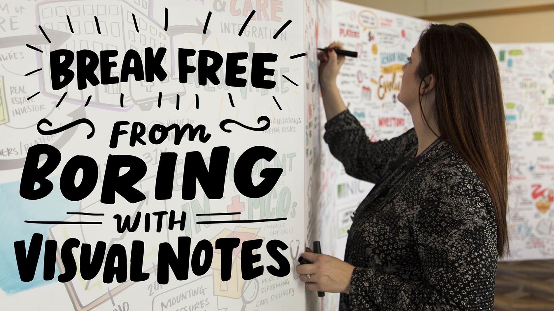
Okay, so if standard presentation design is out, what’s in? For one, visual notes! The magic of visual notes is that they rely on images – rather than words – to reinforce spoken content. Images and words are processed in different areas of the brain, so your audience can take it all in glitch-free.
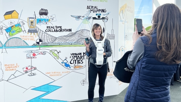
Visual notes are drawn in real-time while someone is talking. And they’re flexible, working across any setting or format – from in-person conferences and tradeshow booths to virtual breakout sessions – to increase event engagement. Here, we round up the benefits of adding live drawings to meetings and events.

1. Visuals reinforce memory
When combined with the audio stimulus of a presentation, speech, or lecture, visuals have a powerful impact on memory retention and recall. Graduate students at the University of Wisconsin-Madison found that “visual stimulation is more effective than audio stimuli at achieving higher memory retention and recall,” and “specifically, it seems that the use of visual stimuli with the act of writing seems to elicit the best recall” (Udomon, et al., 2013). Because words can often be abstract and difficult for the brain to retain, visuals are a more concrete and easy way for people to remember your content––a concept in psychology called the Picture Superiority Effect.
People “remember 80 percent of what they see and do, 10 percent of what they hear, and 20 percent of what they read” (Lester, 2006); so, unlike text, visuals stick in our long-term memory. One study found that participants who viewed only text remembered 10 percent of what they read after three days. But those who viewed text paired with visuals remembered 65 percent of the information three days later (Medina, 2008). Want people to actually remember what you tell them in your presentation? Use visual notes.

2. Seeing an artist drawing live intrigues and inspires people
How often do you get to see an artist at work? Now, how often do you get to see an artist at work visualizing what you just said? When our skilled artists step into a room and put marker to paper, people are inspired. Not only do they get to see what is being discussed come to life real-time with visuals, but they get to see their input reflected in the final drawing. They are able to connect with your content on a higher level, retain and recall what was just said well beyond the event, and continue to be inspired by the visual we created.
3. Keeping eyes busy prevents minds from wandering
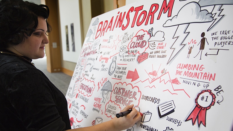
When you are sitting in a content-heavy meeting it is easy to get distracted and for your mind to wander. Previously criticized as a sign that students aren’t paying attention in class, a study found that a group who doodled during a monitoring task recalled 29 percent more information than the non-doodlers (Andrade, 2009). Research further suggests that even the simple act of doodling can help alleviate boredom, keeping the brain from entering a daydreaming or “idling mode,” which helps individuals stay focused during an otherwise stimulating activity (Schott, 2011). Engaging a visual note-taker for your next meeting can help those wandering minds by providing a visual outlet. This will help keep everyone interested and keep their minds from drifting. Can’t say that about boring presentation design, can you?
4. Hand drawn visuals stand out more than standard presentation design
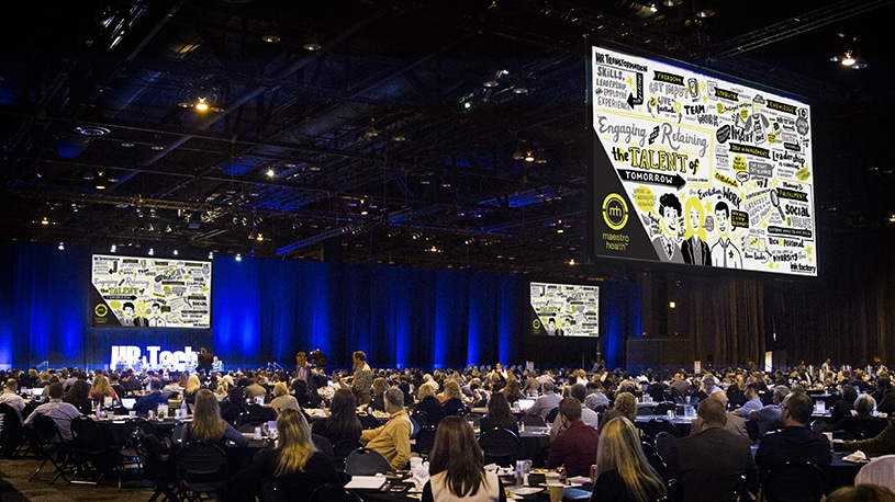
In an increasingly visual world, where PowerPoint presentations are usually considered too wordy, audiences are clamoring for ways to better digest the large amounts of information presented to them. Our visuals help simplify the engagement process by allowing information to be easily retained and recalled. When created in real-time in front of an audience, the process of visual note-taking further enhances this engagement and allows the participant to feel energized and inspired. Not to mention that the hand-drawn look of our visual notes contrast strikingly with traditional templated PowerPoint designs.
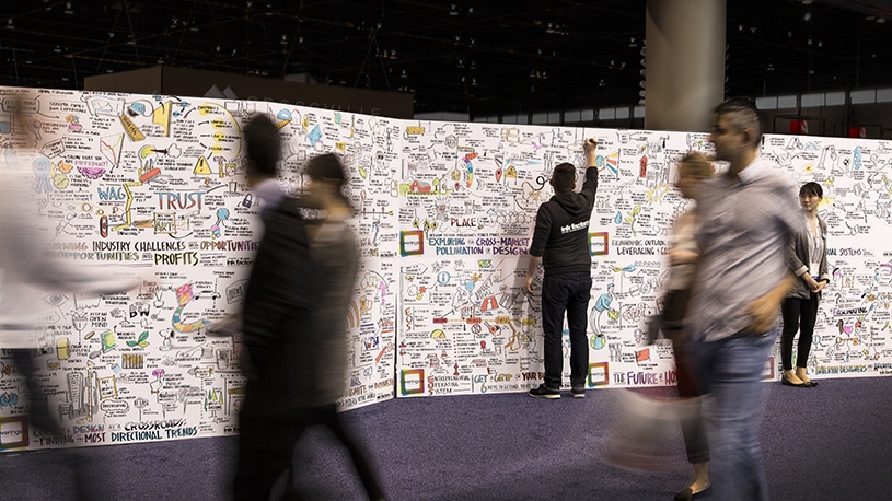
5. Visual notes are a beautiful archive of your presentation
Don’t let people leave your event just to have everything they learned vanish from their brains the next day. With visual note-taking you walk away with a physical archive of the final output, as well as a digital capture of everything created. Hang the physical copy of the visual notes in your office. Send an email with a digital copy of your session notes. Send out postcards of the visual notes. Use them on your social media to reignite the conversation. There are so many ways to use these visuals to sustain event engagement.
Ready to add visual notes to your next meeting or event? Ink Factory would love to help. Let’s connect–we can’t wait to draw something awesome together.
Get presentation tips and more straight to your inbox!
Get the latest visual trends and event engagement inspo delivered straight to your inbox. Subscribe to the Ink Factory newsletter and join our community of 4,000+ visual thinkers!
Sources
Andrade, J. (2010). What does doodling do? Applied Cognitive Psychology Appl. Cognit. Psychol., 24(1), 100-106. doi:10.1002/acp.1561
Lester, P. M., Ph.D. (2006). Syntactic Theory of Visual Communication. Retrieved August 30, 2016, from https://blog.kareldonk.com/wp-content/uploads/2015/03/SyntacticTheoryofVisualCommunication.pdf
Medina, J. (2014). Brain rules: 12 principles for surviving and thriving at work, home and school. Seattle, WA: Pear Press.
Schott, G. (2011). Doodling and the default network of the brain. The Lancet, 378(9797), 1133-1134. doi:10.1016/s0140-6736(11)61496-7
Udomon, I., Xiong, C., Berns, R., Best, K., & Vike, N. (2013). Visual, Audio and Kinesthetic Effects on Memory Retention and Recall. Journal of Advanced Student Science. Retrieved August 31, 2016.
