Visual Note-Taking Strategies: Composition
At Ink Factory, we know that taking your own visual notes can be intimidating, but we also know that it doesn’t have to be! Taking the first steps into creating your own visual notes doesn’t mean you have to be good right away. You don’t even need visuals if you still struggle to draw. In fact, simply organizing your notes in a visual manner is visual note-taking. These visual note-taking strategies for composition can help you take well-organized notes that are easy to follow.
Next time you go to take bulleted notes, we suggest trying out these tips and tricks. You’ll be surprised how much more focused you are during your next virtual webinar or how much more information you remember from the weekly meeting!

Visual Note Taking StrategY for composition
What is composition?
Composition is one of the most important principles of visual note-taking and what we call the skeleton of your page. It’s a tool that helps to organize and arrange thoughts and ideas and make them work together in a way that makes sense. It’s made up of a few different elements, but the most important for visual note-taking is hierarchy. Establishing a hierarchy of content within your visual notes is what makes them easy to understand.
How do you achieve hierarchy?
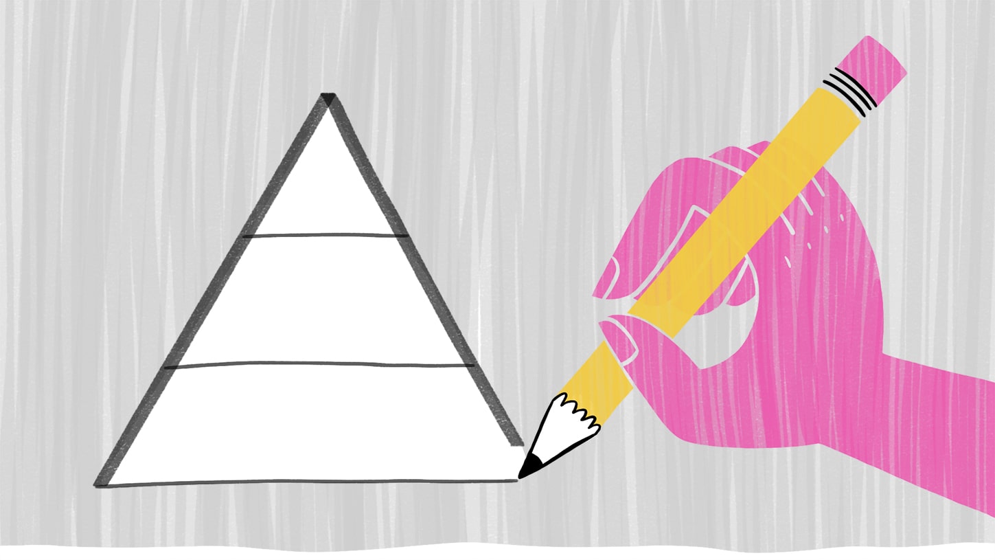
Hierarchy is the note taking strategy we use to show what items on the page are the most important and which are supportive. We do this a few ways, including varying contrast and the size of the text and images to establish a pattern. Typically, the title of your visual notes should be the largest and boldest on the page, your key takeaways should be the second-largest and any supporting details to those key takeaways should be the smallest. This pattern helps you easily identify the most important points and then move to their respective supporting points. It’s easy on the eyes and the mind! You will automatically see the bigger bolder points first, and then your eye will move on from there.
Eye guiding elements
On top of using scaling of text to show hierarchy and set up a pattern, you can also use what we call eye-guiding elements. This note taking strategy can help take out some of the guesswork of which supporting points go to which key takeaways. They help guide your eye around a page and can visually separate content. The easiest way to do this is by using connectors and containers to continue the pattern of organization.
What are connectors and containers?
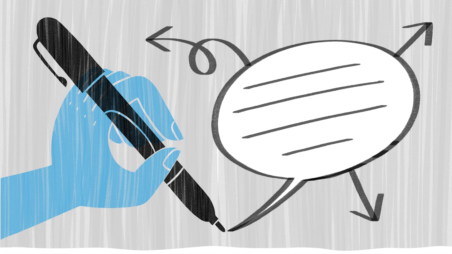
Many things can be connectors and containers, but for people just starting out on visual notes, the easiest connectors are arrows or lines and the easiest containers are boxes, circles, or speech and thought bubbles. Whichever you choose to use, you want to stay consistent in order to support the pattern you’ve established. You’ll want to use the same kind of arrow from key takeaways to supporting points or the same type of container around your key takeaways. This all relates back to the hierarchy of the content, which is key!
Composition Exercise
Now it’s time to implement what you’ve learned! Create a visual note from a talk we’ll provide, but before you begin:
- Remember that you do not need visuals to create a successful visual note
- Take a few minutes on your title before starting the talk and remember it should be the biggest and boldest point on your page. The title for this talk is “Why We Laugh”.
- To establish hierarchy, listen for those key takeaways and their supporting points and adjust the size of your content appropriately
- Stay consistent and set a simple pattern that’s easy for you to follow
Here is the talk:
Once You’ve Finished:
Take a look at your notes and reflect on them and the experience. What was easy? What did you have issues with? Did you stick to the pattern you set in place? Do you think you captured the key takeaways? Share your visual notes with us on Facebook, Twitter, or Instagram, and be sure to tag us!
Curious to learn more?
Dive deeper with a workshop!

$44 | recorded workshop
Organizing Your Visual Notes: Composition
Do you struggle with the layout of your visual notes? What points and visuals go where? Why are some things we capture larger than others? Let us demystify how we arrange our notes into clear compositions in this 90-minute workshop.
